Coffee, Matcha & Tea Packaging: One Cohesive Product Family
Brand Systems / Food & Beverage
Introduction
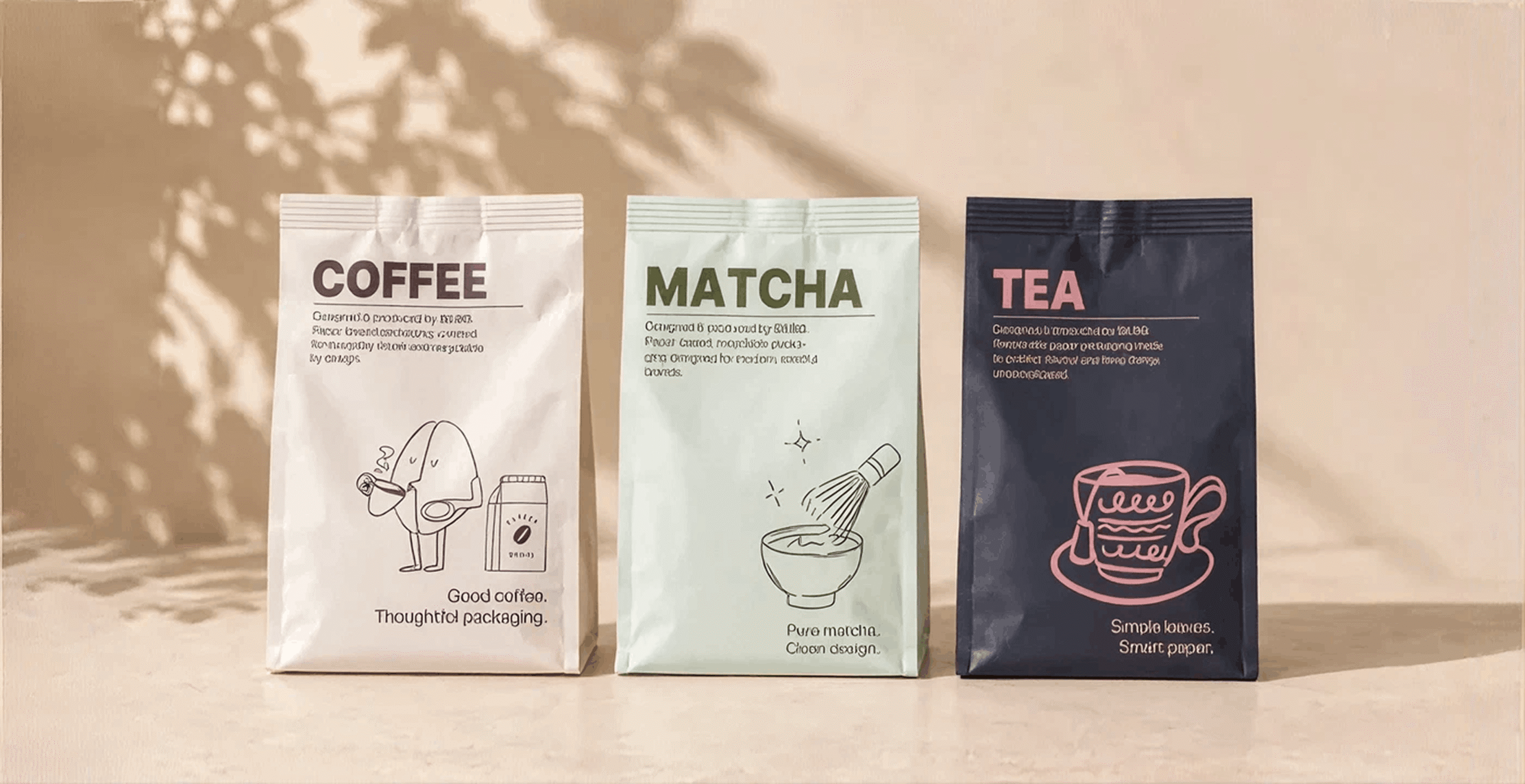
Coffee, matcha, and tea can belong to the same brand without looking interchangeable. A customer should recognize the family at a glance and still know which product is in their hand. That balance takes more than assigning a different color to each box. It starts with a shared layout, a clear naming system, and structures designed around the actual inner packs.
The three products may arrive in bags, tins, sachet cartons, or gift sets. Their dimensions and packing needs are unlikely to be identical. A useful packaging system therefore shares rules rather than forcing every item into one box. This guide shows how to create a range that is consistent on the shelf, flexible in production, and clear to the customer.
Build a visual system before designing variants
Set the elements that should stay constant: logo placement, type families, information hierarchy, illustration style, and the relationship between front and side panels. Then decide which elements can change by product. A common grid makes the range recognizable even when coffee uses a larger carton and matcha uses a compact tin box. Put the product name in a predictable place and give each line enough contrast to be identified quickly. Consistency should help customers navigate the range, not make every package look identical.
Create clear product and flavor cues
Use color as one cue, not the only cue. Names, typography, simple graphic motifs, and a consistent variant label can work together to distinguish coffee, matcha, and tea. Consider how the packaging reads in a small online thumbnail as well as on a shelf. If several flavors or origins exist within each line, establish a second level of variation so the range can grow without redesigning the system. Check that important text stays legible on every background and material.
Let each inner pack determine its structure
A coffee bag, matcha tin, and tea sachet pack may need different box dimensions or inserts. Design each outer structure around the actual filled product, its closure, and any accessories. If two items truly share dimensions, they may be able to share a dieline, but do not assume this before a physical fit test. The front panels can use the same visual grid even when the boxes have different depths or opening styles. This separation between design rules and structural rules makes the system practical.
Plan gift sets as their own product
A mixed beverage set needs more than a larger version of one retail box. Decide which items are included, how they are held, and the order in which they appear when opened. An insert can prevent products from colliding and give each item a clear place. Include room for tasting notes or a card only if it improves the experience. Test the fully packed set for movement and ease of assembly, especially if staff will prepare many orders at once. The gift box should feel like a collection assembled on purpose.
Keep print decisions manageable across the range
A shared material and finish can tie different structures together, but only if they suit each product’s use. Keep a record of colors, artwork versions, dielines, and the elements that change from one variant to another. If labels or required statements differ, reserve flexible space rather than squeezing them in at the end. Review proofs side by side, not one at a time. This makes differences in color, scale, and alignment easier to spot before the range is produced.
Review the range as customers will see it
Line up the final prototypes, photograph them together, and check them individually. Is the brand recognizable? Can a customer identify coffee, matcha, or tea quickly? Do the boxes stand and stack well, and does each inner pack fit without pressure or excess movement? Then test any mailer or gift set with the products inside. A good family system works across the whole journey, from first glance to opening the package at home.